


přerov
corporate identity
in collaboration with ——— Markéta Steinert
competition / semifinal concept
year ——— 2O16
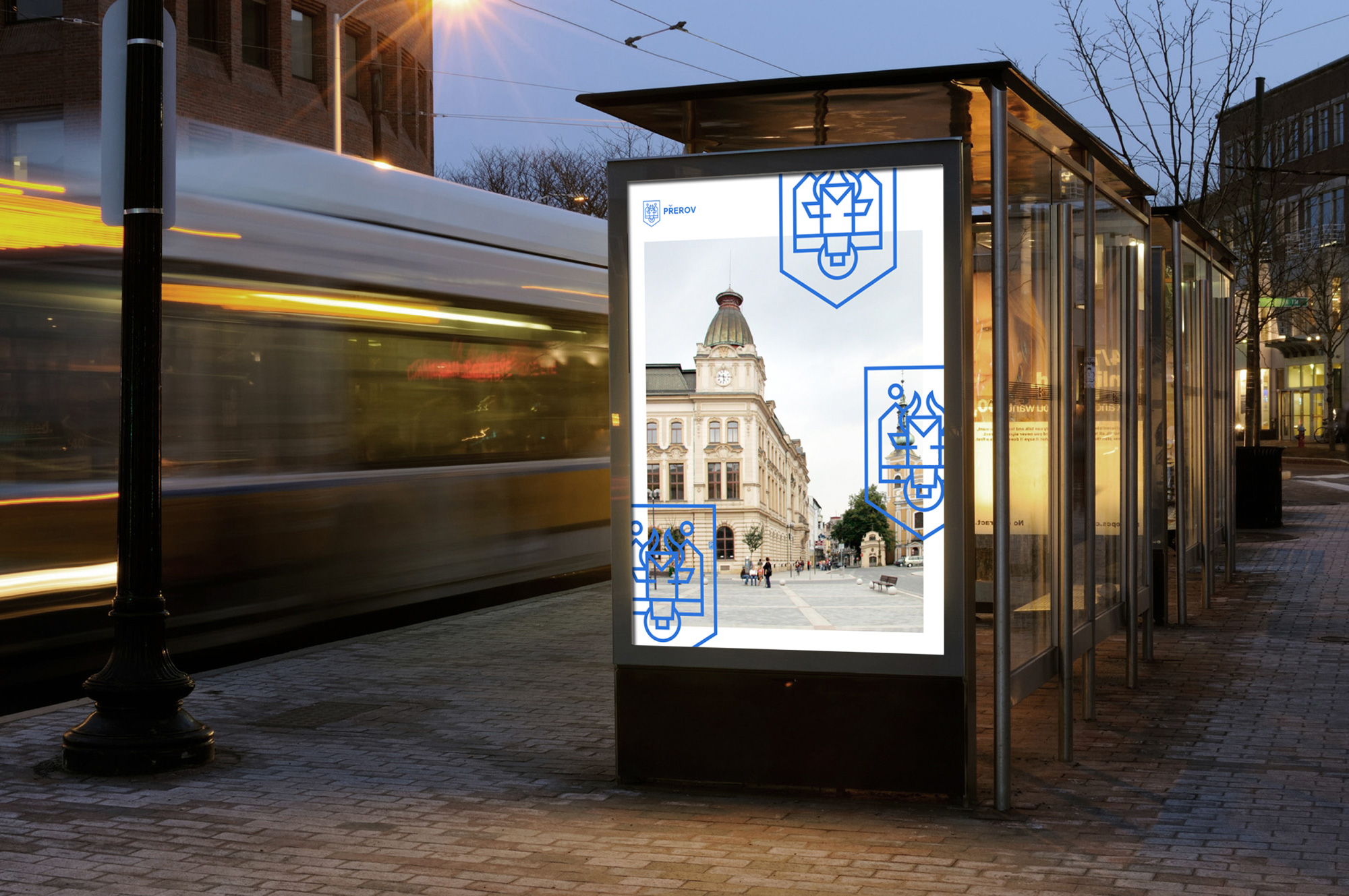
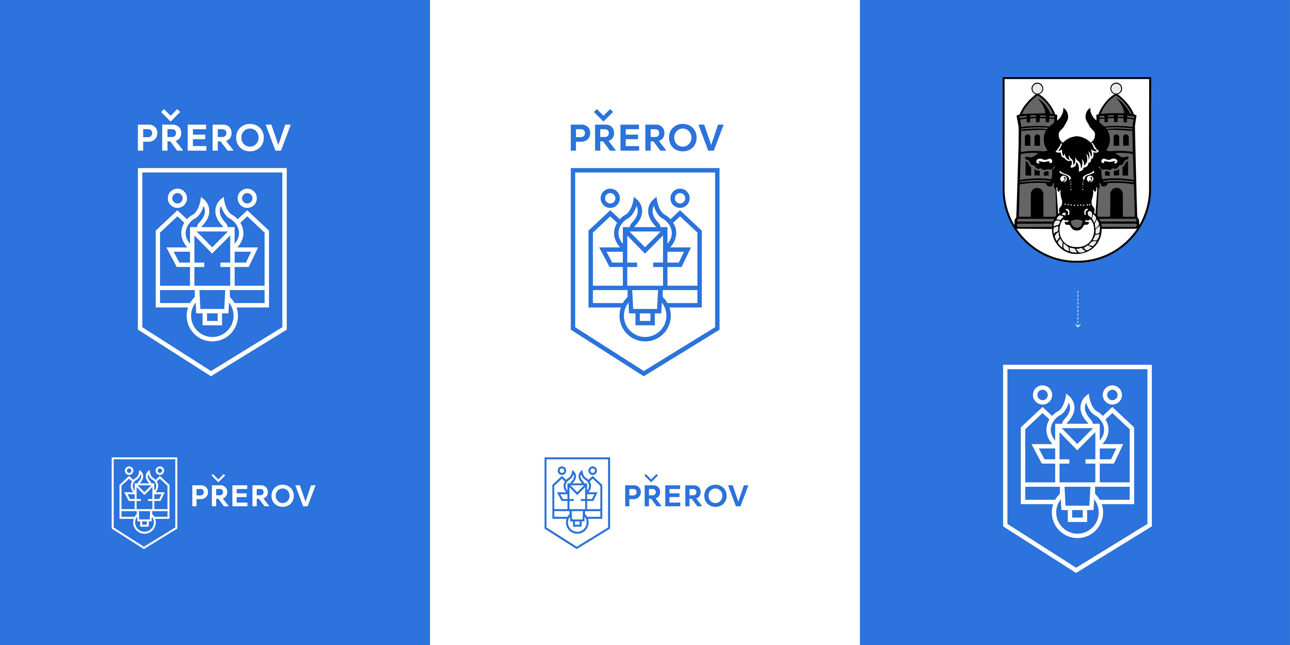
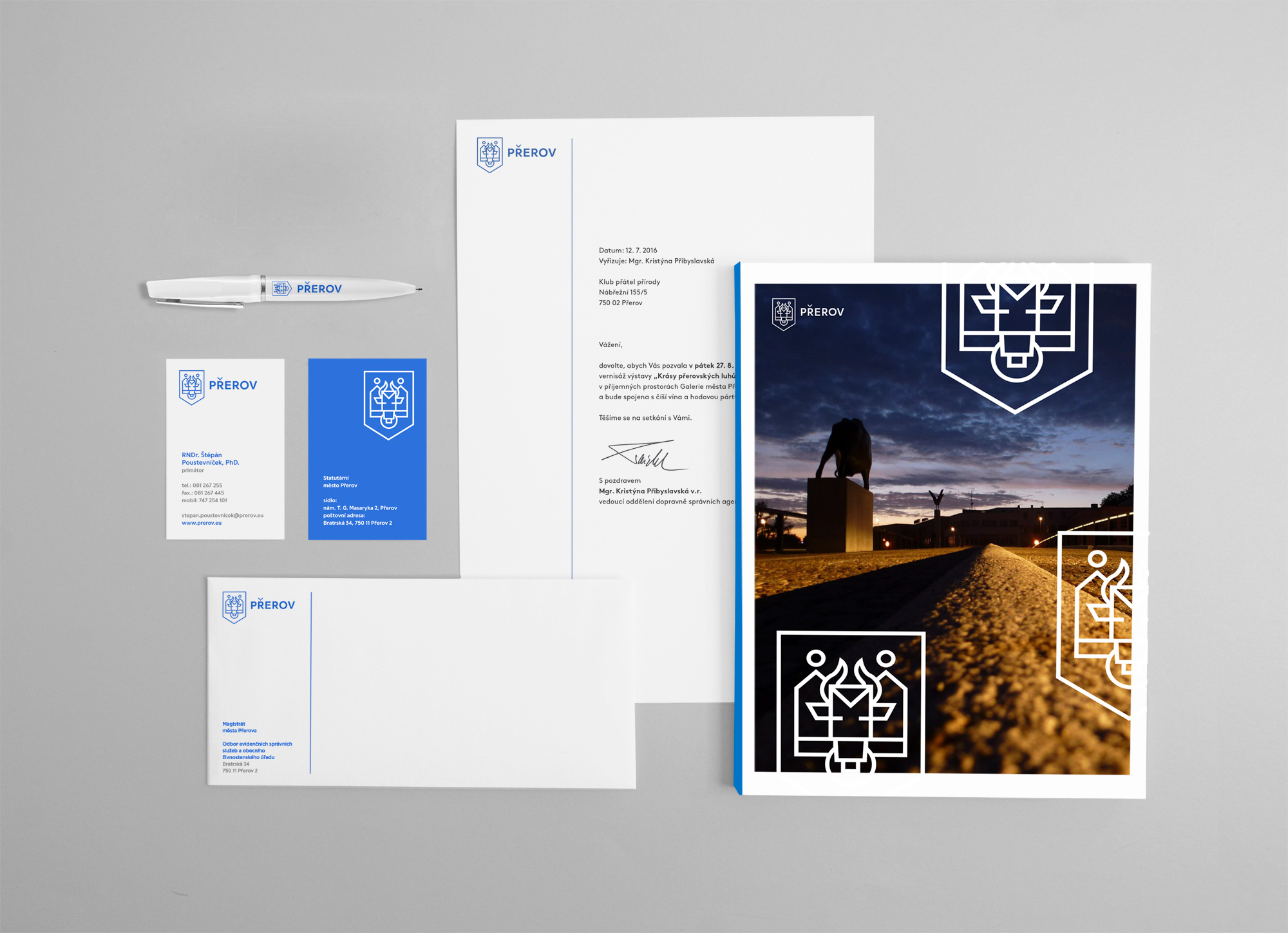
The current logo of Přerov, which takes the form of a coat of arms, reflects the origin of the city. It was important for us to preserve the inspiration with history when creating a new logo. The coat of arms is a traditional feature representing each community and territory. That is why we wanted to continue the tradition, preserve genius loci and bring it into the context of contemporary modern world. The logo is a redesign of the coat of arms and due to the simplicity and expressive styling it can be reduced while remaining legible and identifiable. The motifs of a bison and towers are preserved and they can be used as visually attractive elements of all printed and promotional material of the city. Thanks to the specific link between the historical context and modern style, our logo lends the city of Přerov instant recognisability among visual styles of other cities.