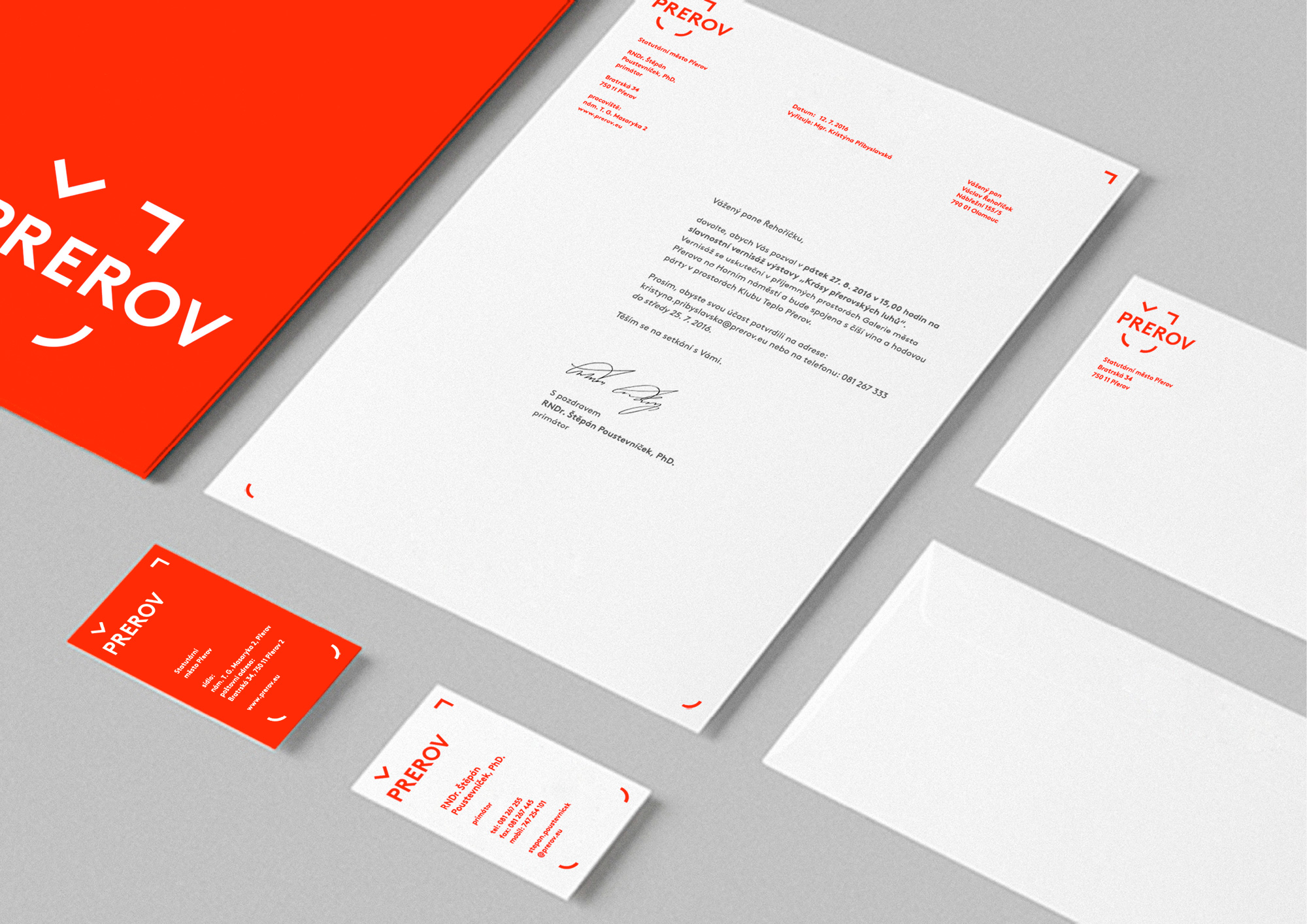


přerov
/ RED /
corporate identity
final concept / not realised
in collaboration with ——— Markéta Steinert
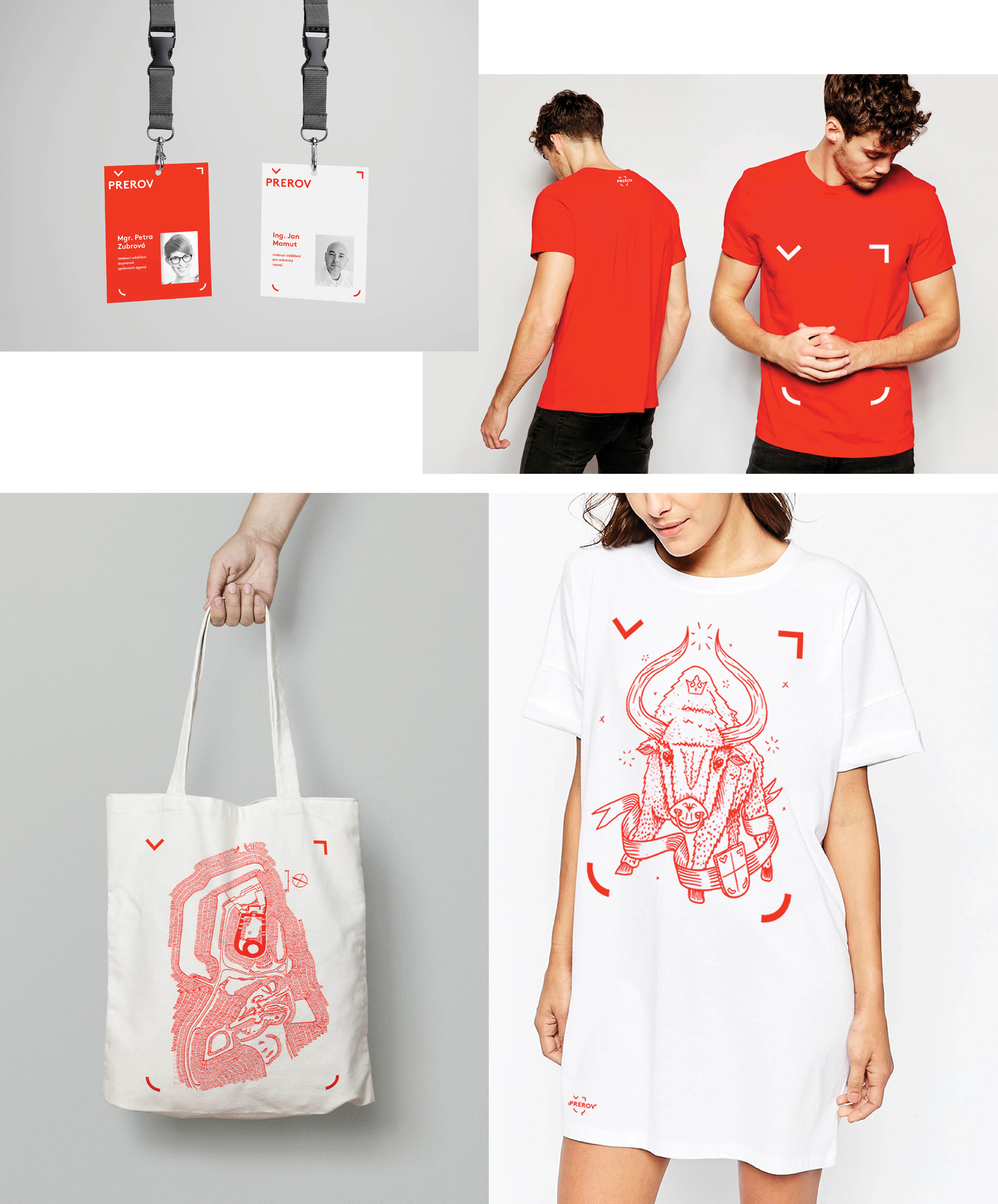
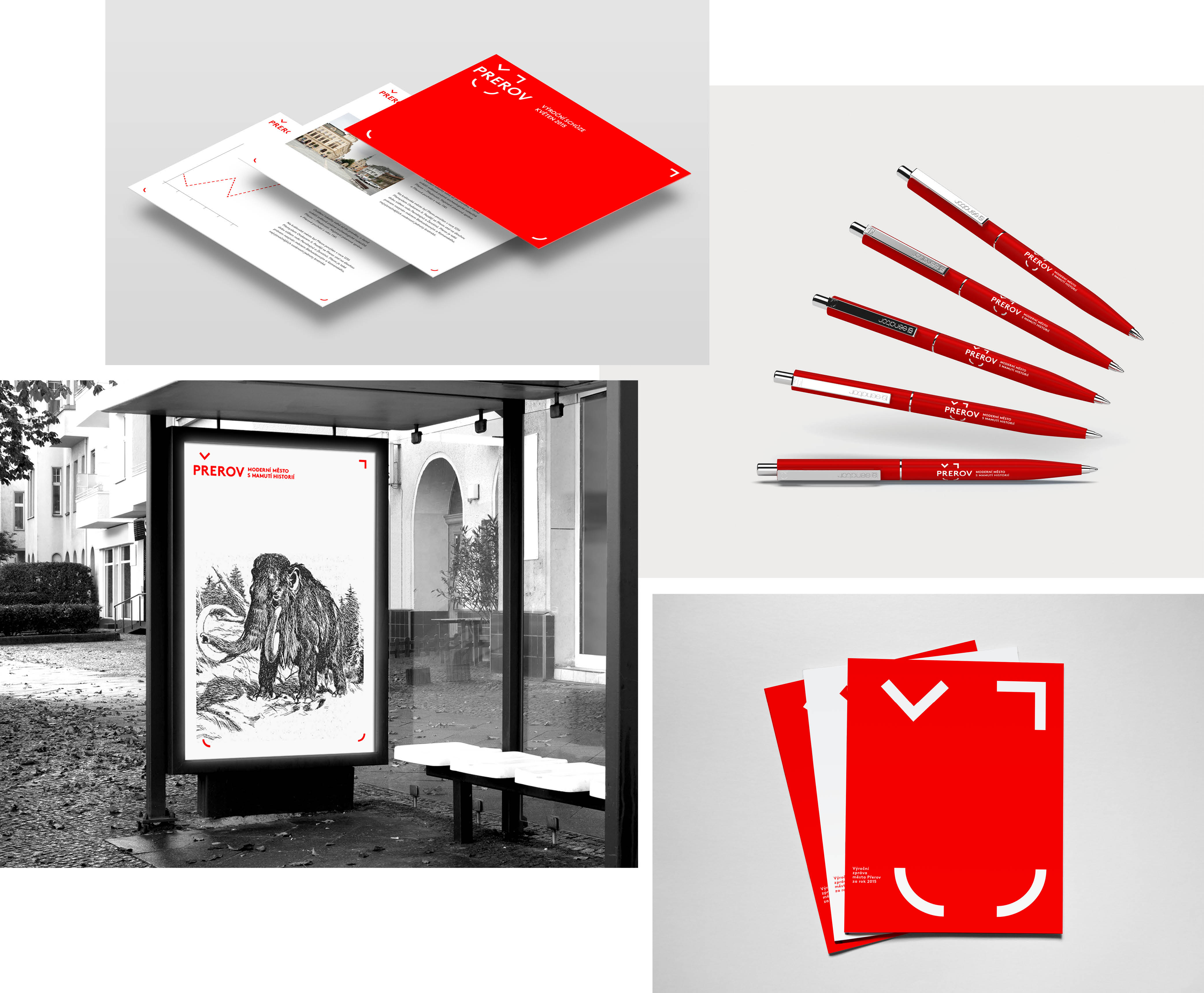
illustration by ——— Matěj Moravec
year ——— 2O16
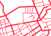
The town of Přerov lies on the Bečva River and is an important road junction at the very heart of Moravia.
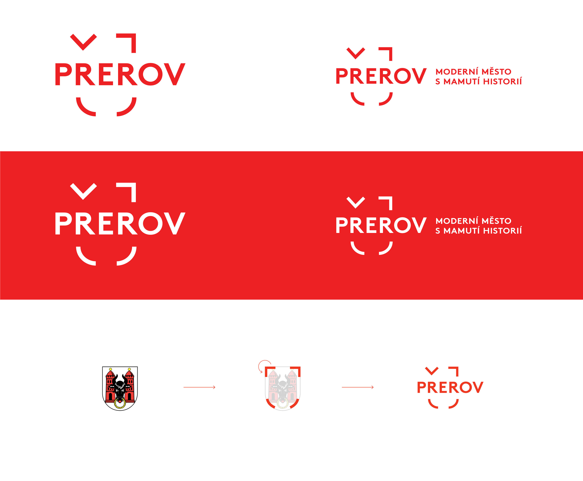
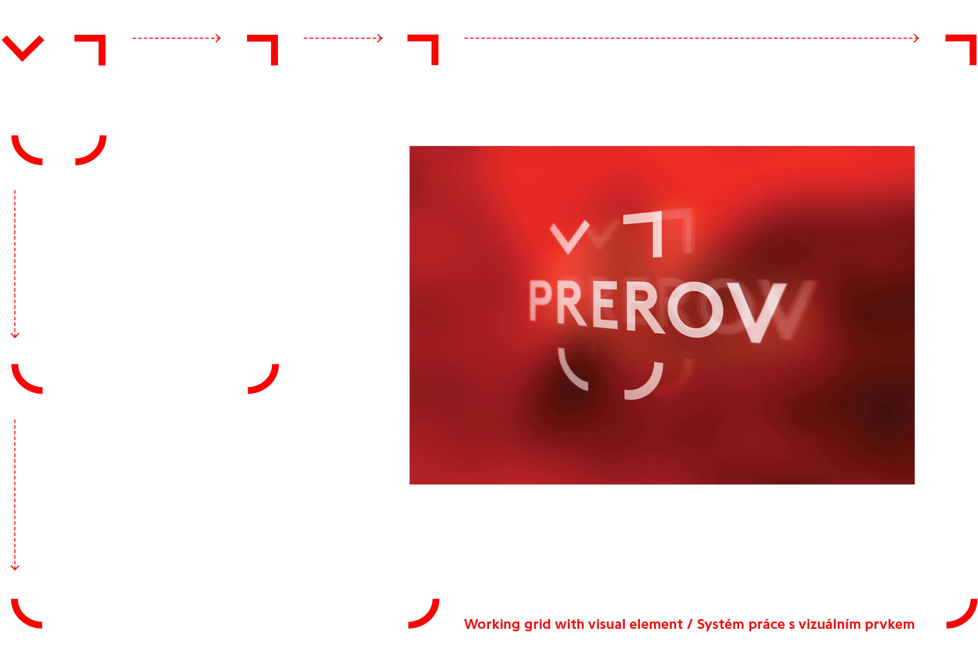
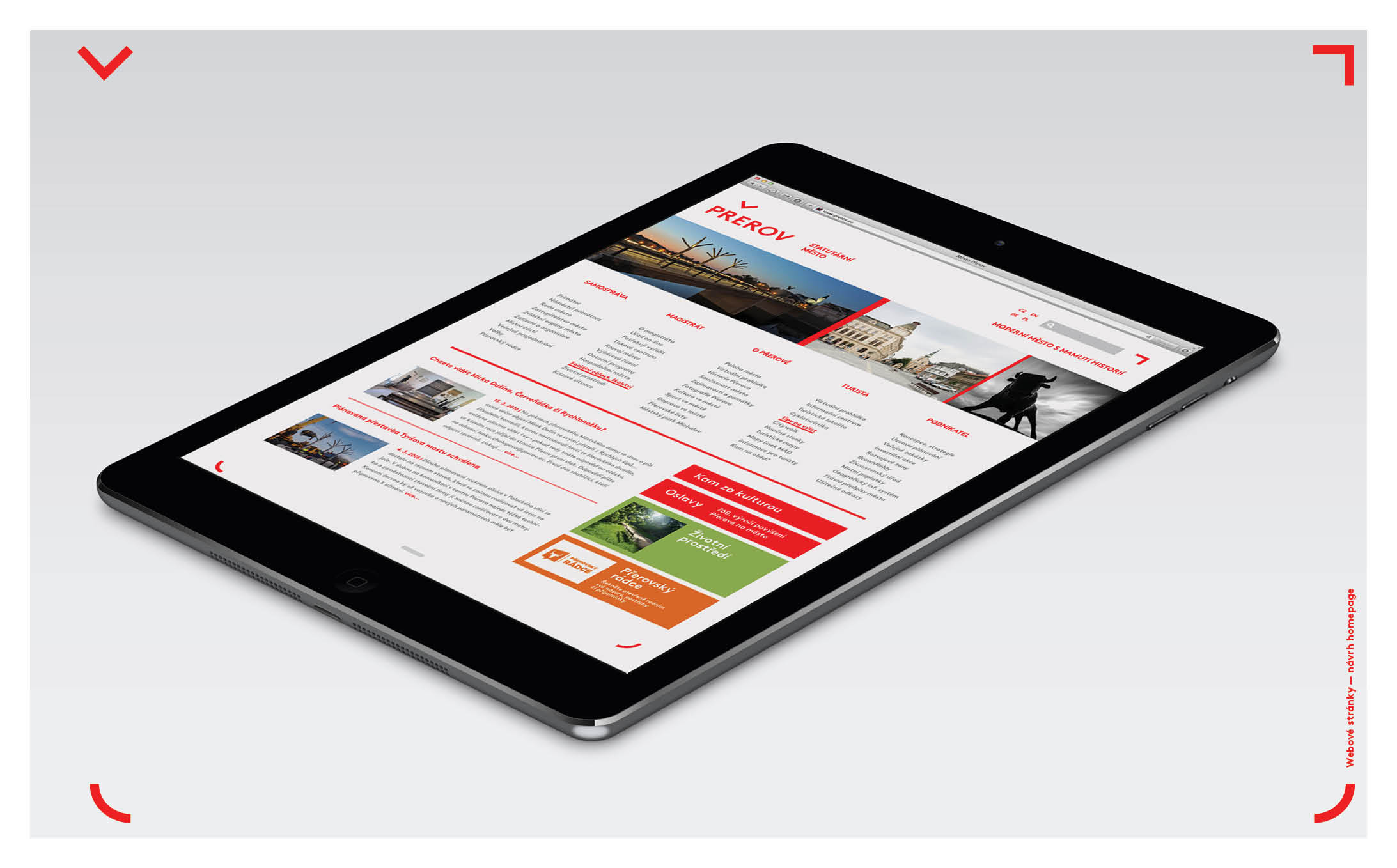
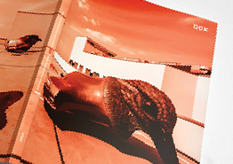
This typograhical design is based on a play that gives the city of Přerov new modern symbolism. It is a typographical mark, which — rotating in the upper left corner of a stylised coat of arms, forms a hook above the letter "R" and simultaneously evokes the horns of a bison, which is a well-known symbol of the town of Přerov. The logotype is specific in that it not only serves as the logo itself, but also as a self-contained visual element that makes it easy to identify the city.